

In this post we will be learning how to do technical analysis in share market with the help of various tools and indicators.
Technical analysis helps in making your trade to be better positioned, in comparison of doing just blind trade.
Therefore, in this post we will be discussing the most important technical analysis tools that can help traders as well as investors.
So, let us begin and learn them one by one.
Technical Analysis – Support & Resistance
If you are a day trader or want to do intraday trading in market first thing to remember is Support and Resistance .
The Concept of support & resistance possibly the most important aspect of technical analysis in market .
Most of the technical analyst uses this to make entry and exit while trading in market.
What is Support?
Support is a price level of a stock where there will be more buyers than sellers.
Whenever any stock start falling S1 or support level 1 is the first price level where you will see halt or pause.
It does not mean at all that price would sustain there and than move in upward direction.
The price of a stock depends upon the trend . If there is downtrend than at S1 it will stop for a while and than fall eventually.
The reason for any stock to move upwards from it support is rise of demand due to falling share price .
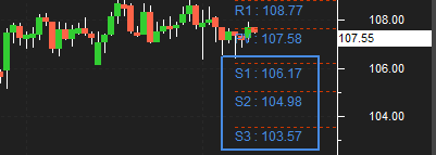
In the chart above you can see a rectangle with values return S1,S2,S3 . These are different support level for any stock . Whenever the price of a stock falls to any of this level , it is very likely to bounce back .
You can easily see there is a candle (type of chart) which did came because of fall in price and at around Rs.106 .50 it went up from there .
With this in mind one can try entering at this levels for a trade and take benefit of rise .
As we can see in chart Rs.107.55 is the current market price of a stock and down there there are different support levels .
Most of traders have a firm belief on support and resistance , they assume that price would make a reversal from this level .
Hence one of the basic trading method using support is to buy near support in uptrend .
What is Resistance?
The word resistance itself describe the whole story , it means to stop something . We learned support previously similar to that is resistance .
The different level of resistance stops the stock from moving further upwards .
The moment a stock hit the R1 level similar to support it will halt for sometime ,depending up on the trend it will settle in that direction .
Either it may go upward or downward .
The reason for any stock to move downward from it resistance level is due to heavy sell-off at rising price .
Mostly the sellers trade at this level ,it is a trigger point for them .
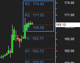
In the chart above the current market price (CMP) of stock is Rs.169.10 which means it has hit the first level of resistance .
Another key point over here is consolidation of price and its movement ,candlestick chart reflect the price consolidation at R1 .
There are 4 hourly candles at Rs.168.60 to Rs. 169.50 , it means the price is not moving upwards due to resistance .
Based on this any trader can apply the strategy. when a trader is long(or bought shares) he can look at resistance points to set targets and to set exit points for the trade.
When a stock price hits the R1,R2 or R3 the price may eventually break through it, although the price would try to sustain at this level a number of times before doing so.
Point to remember : Buying near support or selling near resistance can yield good results , but there is no guarantee that the support or resistance will hold .
Intraday Trading With Support & Resistance
Till now we have tried to understand basics of support and resistance in intraday trading . Please note that support and resistance keep on changing everyday .
The one we have discussed above is only for intraday trades .
Long term Support & Resistance is useful for swing trading where as Short term Support & Resistance is useful intraday and BTST (buy today sell tomorrow) trades .
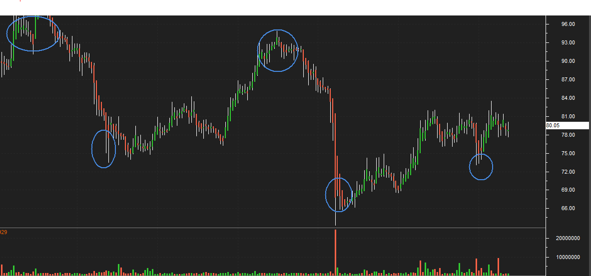
Above we have used 12 month chart to know different support and resistance level in last 1 year for Karur vysya bank .
As you can see there is major resistance at Rs. 90 -100 and support is @ Rs. 65 -75 . You can consider this price for entry or exit position in case of short term trading perspective .
Although you can use 24 to 60 months chart as well , to better understand and draw conclusion regarding the support and resistance .
furthermore whenever you buying at support wait for the consolidation to happen and check if it breaking the support level or holding it . Similarly for resistance too if selling wait for consolidation to begin any trade .
Sometime the stock may make false breakouts i.e stock prices will often move slightly further (higher or lower) than we expect them to move.
This doesn’t happen all the time, but when it does it is called a false breakout. Do not get trap in this eventually it will come to S&R level after some time .
For instance if a stock currently trading at Rs. 100 and S1 is Rs 97 , if it start falling than it may come down below Rs.97 to Rs. 96.10 or above Rs.97 to Rs. 97.45 .
Whatever it comes to it will wait there for consolidation before deciding the direction . Same goes for resistance also .
S&R are areas not exact price so expect some variability in price movement around it .
S&R can be used to identify targets for the trade. When you are buying stock (For a long trade), look for the immediate resistance level as target.
For selling stock (short trade ), look for the immediate support level as target. I am referring target here as the point, when you will exit the trade and book your profit .
This was all about support and resistance for now , we will be discussing about various technical indicators and charting style in upcoming blogs .
Keep learning the more you know the chances of you becoming a success will be much higher .
Simple Moving Average (SMA)
Simple Moving Average (SMA) is one of the core technical indicator used by traders & investors for technical analysis of a stock, index or any securities .
Simple Moving Average is calculated by adding recent closing price of a stock and than divide by number of days (time period).
Before we jump to learn in depth ,let us know the basic arithmetic behind simple average .
We all have studied in school about averaging concept or even in our daily life we do it regularly. When we ride motorcycle or drive car we check its average.
In sports too you have seen batsmen in game of cricket his average score ,for example- if he had scored 60 , 54 , 76 , 98 ,27 in last 5 matches.
Than we calculate it by adding all scores & dividing by no. of matches played . The average would be 63. SMA is just math.
So by calculating average of a batsmen one can predict or assume that he would score at least this much runs .
This case is not always true however the chances remains very high . Similarly SMA helps in predicting the future trend & determining if an asset price will continue or reverse a bull or bear trend.
So basically its a trend direction indicator .
You do not need to calculate it manually, whichever trading platform you are using it will be available as its one of the basic indicators in Stock market.
SMA specifically tells If it is points up, means that the security’s price is increasing. If it is pointing down it means that the security’s price is decreasing.
Make sure to select the longer the time frame for the moving average, as it flatten the simple moving average.
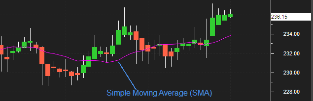
In this chart pink line indicates the simple moving average, its 14 days period average calculated.
You can see the moment a candlestick chart goes above the SMA it’s sign of trend reversal. The uptrend continues for couple of sessions.
Whenever Price crossing SMA is often used as trigger for trading.
When prices cross above the SMA, you might want to go long (buy) or cover short (sell) when they cross below the SMA, you might want to go short or exit long.
You can use the longer the period of the SMA, for the smoother result. first thing to remember that SMA depends primarily on historical data .
By using this we are only analyzing the possibility in future .
A 200-bar SMA is commonly used for the long term trend whereas a 50-bar SMAs are typically used to measure the medium trend.
What Is Simple Moving Average Crossover Strategy?
Too many traders have tried to use the SMA to predict the exact sell and buy points on a chart.
Although if market are sideways the plain Moving Average we have discussed will not be sufficient. As it may give too many signals .
To counter this you can use SMA Crossover Strategy .
Also know as Double cross-over method. Double crossovers involve one relatively short moving average (less day ) and one relatively long moving average.
It will help you to take less trades in sideways market. It’s an improvisation of Simple Moving Average .
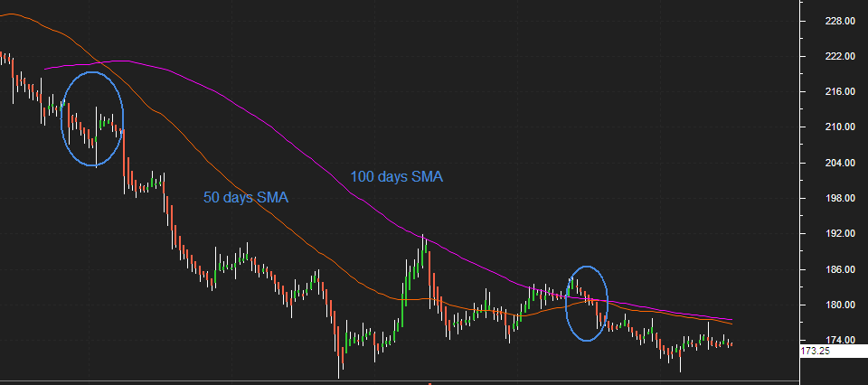
As you can see in the chart, we have used 100 day SMA with 50 day SMA .
One of the most popular simple moving averages to use with a crossover strategy are the 50 and 100 day.
When the 50-simple moving average crosses above the 100-simple moving average, it creates a golden cross. This will help in smooth out the entry and exit positions from market .
In the chart above pink line represent 100 day SMA & Orange is 50 day SMA .
The Pink 50 day EMA line is closer to the current market price when compared to the orange 100 day EMA.
In a Moving Average crossover system, instead of the usual single moving average, the trader combines two moving averages.
Points to Remember
A Bullish crossover occurs when the shorter moving average (50 days) crosses above the longer moving average (100 days) .
A Bearish crossover occurs when the longer moving average (100 days) crosses above the shorter moving average (50 days) .
A trader can use various combination to create a Moving Average cross over strategy.
Exponential Moving Average (EMA)
Exponential Moving Average (EMA) is one of the essential technical indicator used widely by traders and investors .
Exponential Moving Average (EMA) gives more weighting to recent price data compared to Simple Moving Average (SMA) .
EMA is quite similar to SMA as it helps traders to measure trend direction of any security thus helps in predicting the future trend .
Essentially its a trend direction indicator .
Relative Strength Index Indicator Explained
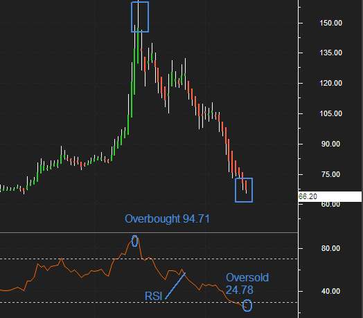
First thing to remember while using RSI is , when the indicator is above 70 for a particular stock it is considered overbought whereas when the indicator is below 30 it is in oversold zone .
Another key point as you can easily see in charts above ,the moment stock has hit the overbought trajectory i.e above 80 , it created a signal .
Similarly when stock moved down below 30 you can see RSI is oscillating in oversold condition . This helps in knowing the general trend of a stock .
Keep this in mind that you do not need to calculate it by yourselves .
It will be available as a technical indicator inside your trading tool .
Another key point is you may decide to use 5,10,20, or even 100 days look back period if you want too. Using 14 days is not compulsory .
Try making your own strategies , as it help in giving you a edge over others .
Relative Strength Index (RSI) indicator For buy and sell signals:
RSI indicator is much more than buy or sell signal. It can help you in knowing the trend whether , upwards downwards or sideways .
As we have discussed earlier , just to remind you again consider these points :
- When the RSI is between 30 and 0, the security is supposed to be oversold and usually follows an upward correction.
- When the security reading is between 70 and 100, the security is supposed to be over bought and is prepared for a downward correction .
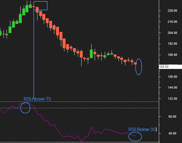
In the daily chart Above of TATA MOTOR’S , we have used default 14 days period . Pink line representing the RSI signal , its above 75 and can be seen in overbought zone .
Like wise when RSI Signal showing below 35 its now in oversold zone . Being a trader or investor you can benefit from this signals .
Either by going long when its in oversold zone & short when its in overbought zone .
Few points before we take any trade using RSI Indicator
- In case of an uptrend or market being bullish ,the RSI tends to remain in the 40 to 90 zone with the 40-50 zone acting as support.
- Whereas during a downtrend or market being bearish the RSI tends to stay between the 10 to 60 range with the 50-60 zone acting as resistance.
- A stock can be in uptrend for few days to few years therefore, RSI will remain stuck in the overbought zone for a long time, this happens because RSI cannot go beyond 100.
- Being a trader you would be looking at shorting opportunities but the stock on the other hand will be in a different region.
- For Instance, MRF’s shares grew sharply by 2,210 per cent between May 11, 2009 to May 9, 2019. The stock growth consolidated to 154.83 per cent in the last five years.
- Similarly a stock with bearish nature constantly in downtrend stuck in the oversold region for long ,the RSI would be going below 30 to 0.
- It cannot go beyond 0. In this case as well the trader will look for buying opportunities however the stock will be going down lower.
- For example, Gitanjali Gems topped the list year (2018) by destroying 98.55 per cent of investor wealth in a year.
The Relative Strength Index (RSI) is most trustworthy indicator in market . Whenever the price is oscillating between bullish and bearish periods.
However ,do note use RSI alone as an indicator, it should be used along with other candlestick patterns and indicators to study the market.
If you are new to trading, combining the RSI with another indicator like volume or moving averages will keep you ahead of other traders . Few brief point important are listed below :
- In case if RSI is stuck in an overbought region for a long period, check for buying opportunities instead of short.
- If RSI is firmed in an oversold region for long time, look for shorting opportunities rather than buy.
- In case if RSI reading starts moving from the oversold zone (Going above 30) after a long period, look for buying opportunities.
- In case if RSI reading starts moving from the overbought region (Falling below 70) after a long time, look for shorting opportunities.
MACD Indicator (Moving Average Convergence and Divergence)
(MACD) Moving Average Convergence and Divergence is an distinctly very popular momentum indicator used in Technical Analysis.
It can be used to identify overall trend of a security. The Moving Average Convergence and Divergence indicator was created by Gerald Appel in the late 1970s .
It is a combination of 2 different type of Moving Averages (MA). Generally we use Exponential Moving Average (EMA) for calculation of MACD.
The basic reason for taking the two moving average is that one should be of shorter time period and the other longer time period.
It is calculated using a 12 day EMA and a 26 day EMA. Another key point is both the EMA’s are based on the closing prices.
We deduct the 26 EMA from the 12 day EMA, to estimate the convergence and divergence value.
However this is not always the case ,for instance you can use Short-term intervals – 3, 5, 7, 9, 11, 12, 14, 15-day. For Long-term intervals – 21, 26, 30, 45, 50, 90, 200-day.
Besides this 9-day and 12-day duration are more popular in short term. Where as 26-day, 50-day intervals are more used for long term intervals .
General parameter of MACD
- 12 day EMA
- 26 day EMA
- MACD line (12D EMA – 26D EMA) represented by the orange line
- 9 day EMA of the MACD line represented by the blue line
You do not need to calculate this complex mechanism in order to know the values of MACD.
As now most of the companies including your broker will provide you with the terminal, where one can easily apply this indicator.
So ,instead of calculation we will be knowing the basics and how to use it for Trading or Investing .
The values of 12, 26 and 9 are the majorly used with the MACD, though other values can be used depending up on your trading goals.
The shorter moving average (12-day) is faster than the longer moving average (26-day) in reacting to price changes in the underlying security.
Using MACD In Trading and Investing
- The view point is bullish when the MACD line crosses 9 day EMA. Whenever MACD line is greater than the 9 day EMA a trader should look at buying opportunities .
- The view point is bearish when the MACD line crosses below the 9 day EMA. whenever MACD line is lesser than the 9 day EMA a trader should look at selling opportunities .
- MACD crossing above zero (signal line) is considered bullish, while crossing below zero is bearish.
- Whereas when it turns upwards from below zero it is considered bullish.
- When it turns down from above zero it is considered bearish.
This unique composition of trend and momentum can be applied to Hourly, daily, weekly or monthly charts. As shown in the above chart,
when the MACD falls below the signal line, it is a bearish signal which indicates that it may be time to sell.
On contrary, when the MACD rises above the signal line, the indicator gives a bullish signal, which guide one, that the price of the asset is probably to experience an upward momentum.
The MACD and signal line move above and below the center line or zero line to signal a trend such as overbought and oversold conditions.
When these two EMA move close to each other, it is called convergence, and when they move away from each other ,it is called divergence .
Bollinger Bands Indicator
Bollinger Bands are a technical analysis tool used to analyse volatility of a security. Bollinger bands helps in identifying the overbought and oversold levels.
John Bollinger introduced bollinger bands in 1980’s.
Bollinger Bands can be used on most financial instruments like equities, indices, foreign exchange, commodities, futures, options and bonds.
What is Bollinger Bands?
They are curves drawn in and around the price structure on chart.
It primarily consist of a simple moving average (also known as the middle band), an upper band, and a lower band.
This bands helps in knowing whether prices are high or low on a relative basis.
This curves when drawn on a chart helps in taking buy or sell signals. Whenever the price touches the upper band a sell can be triggered.
On the other hand when price touches lower band a fresh buying position can be started.
How are Bollinger bands calculated?
Bollinger bands are calculated by assembling this 3 elements given below :
- Middle line usually a 20 day simple moving average of the closing prices.
- Upper band – this is plotted +2 standard deviation above the middle line
- A lower band – this is plotted -2 standard deviation below the middle line
Standard deviation (SD) is same as volatility. Standard deviation is a mathematical measurement of average variance used in statistics, economics, accounting and finance.
A simple moving average is used because the standard deviation formula also uses a simple moving average.
Do not get worried as you will not be calculating this values by your own. On your trading software it is easily done just by few clicks.
How does the Bollinger band work?
To know how bollinger bands works let us see a chart and do some analysis. Below is the recent Day Chart of TATA MOTORS LTD.
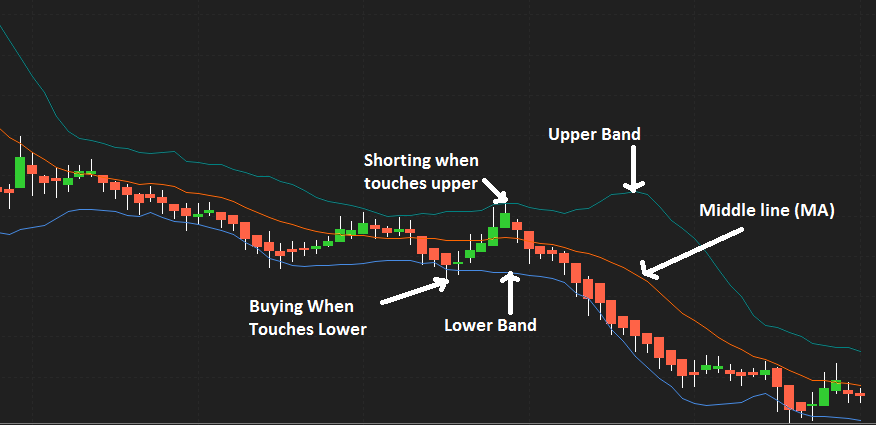
As you can see i have plotted the bollinger bands on chart .The middle orange line is the 20 day SMA.
The other two lines placed above and below the middle line are the +2 Standard Deviation & -2SD.
Whenever there is uptrend in a stock it tends to travel from lower band to upper band. I have highlighted using a arrow all the buy & sell signals BB generated.
The plan is to short the stock when the price touches the upper band. However it will first revert back to middle line which is also average.
This act as an strong support during downtrend. Similarily one can buy when the price touches the lower band. The middle line will act as an resistance in that case.
In chart above can you see the continuous downward rally? A chartist or analyst will use this in his favour by riding the rally.
The price is frequently touching the lower band while falling low from middle line. As there is no sign of stock showing reversal to middle line, you can short the stock till there is any new signal.
Also observe the candlesticks stop touching the lower band and resisted for some time. This shows the sideways trend for some time in stock.
So to say, if you see couple of candles touching upper or lower band than it can lead towards same direction.
However you can look for shorting opportunities at upper band and going long at lower band.
Bollinger Bands Trading Strategy Points To Remember
- Closer the prices move to the upper band, more overbought the market.
- closer the prices move to the lower band, more oversold the market.
- Buying when stock prices cross below the lower Bollinger Band.
- Selling when stock prices cross above the bollinger band.
- It is useful in trending as well as non-trending market.
- The upper and lower bands act as a trigger to open a trade.
- Breakout above or below the bands is a crucial event.
- The breakout is not a trading signal.
- However a new trend towards up or down indicating a strong momentum.
- Wider the bands greater is the volatility.
- Narrow bands reflects low volatility hence sideways movements.
- Bollinger Bands are not meant to be used as a stand-alone tool
Fibonacci Retracement
Fibonacci retracement is a tool used in technical analysis in stock market.
Fibonacci retracement levels are plotted horizontally on a chart to indicate possible support and resistance levels.
Each level is shown as a pecentage. The Fibonacci retracement main levels are 23.6%, 38.2%, 61.8%.
This has been observed numerously, whenever a stock moves either upwards or downwards sharply, it generally tends to retrace back before its next big move.
For example – you might have seen a stock does go for a rally up from Rs.80 to Rs.150, then it is likely to retrace back to probably Rs.115, before it can move Rs.180.
The percentage 23.6%, 38.2%, 61.8% shows it’s level of retracement.
Therefore in order to understand Fibonacci retracements better, one must know about the Fibonacci series
0, 1, 1, 2, 3, 5, 8, 13, 21, 34, 55, 89, 144, 233, 377, 610, 987…series extends to infinity.
Observe the following
1+2=3, 89+55=144, 987= 610+377, 13= 8+5
One more important factor is when you divide any number in the series by the previous number the ratio is always approximately 1.618. This is also know as PHI.
You might have studied this in your school as well.
For example
987/610=1.618 , 55/34=1.618 , 144/89=1.618
How do you place Fibonacci retracement on chart?
Fibonacci retracements plotted on chart using horizontal lines. You need to first identify the 100% Fibonacci move.
The 100% move can be an upward rally or a downward rally.
This lines indicates areas of support or resistance. Using your trading terminal or software you just need to select this as a tool.
To mark the 100% move, we need to pick the most recent peak and low on the chart. Once this is identified, we connect them using a Fibonacci retracement tool.
This tool is available in most of the technical analysis software.
After selecting the Fibonacci retracement tool from the charts tool, you have to click on lowest candle on chart, and without un-clicking drag the line till the peak point.
The Fibonacci retracements levels starts getting plotted on the chart.
After you finish selecting both the low and the peak fibonacci retracements levels are drawn. This is how the chart looks after selecting both the points. Thus making them useful for swing traders & short term investors.
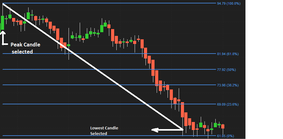
In the above day chart you can see the downward rally. I have selected the candle on peak(100%) level to 0% the lowest candle.
The stock has declined and made new low. However you can see the stock attempted to bounce back.
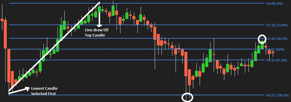
In the Above Day chart I plotted Fibonnaci levels from bottom to peak of candle. As you can see after touching the 0% level it started falling back to 23.8%.
It was acting as support, than it broker the levels to fall below at 61.8%. As you can see in the chart once it reached the level of 100% it started bouncing back .
How To Use Fibonacci Retracement Levels?
Suppose you wanted to buy a particular stock, however due to sudden run up in the stock you missed the opportunity.
In such circumstance you can wait for a retracement in the stock. Fibonacci retracement levels such as 50%, 61.8%, 38.2%, and 23.6% even 0% act as a potential level upto which a stock can correct.
Once you identified the levels you can opt for the trade and make a entry.
There will be Six horizontal lines drawn as given in the chart above.
The first is at 100% point on the chart, the second at 61.8%, the third at 50%, the fourth at 38.2%, the fifth at 23.8% and the last one at 0%.
As a matter of fact you can use the this tool to find a position after a dowtrend as well as uptrend.
In case of upward trend in a stock you can figure out the definite fibonacci points. These point will act as an entry point for your trade.
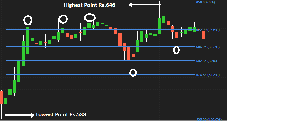
As you can see in the chart of AXIS BANK LTD. Stock rallied from Rs.536 till Rs.646. Therfore the difference is of 110 fibonacci point (646-536).
After the upmove one can anticipate a correction in the stock to last up to the Fibonacci ratios.
Can you observe at 23.6% acting as a resistance. Stock started to retrace back and finally it started falling till it reached 61.8% level.
Now 61.8% is acting as an support during downtred. The stock rallied from 61.8% till it made a high which is also the highest fibonacci level 0%.
Again the started falling till it reaches 38.2% acting as an support now before resuming its up move.
Volume In Share Market
Volume is one of the most powerful indicator, which is often overlooked by many traders and investors while placing trade in share market.
Volume helps you in knowing about the current perception of all the market participants for a given security. It is easily available on your trading platform, which you use to place trade.
What is Volume?
Volume is a tool to know how many shares have been bought and sold in a given period of time. It helps in analysing the trends and patterns.
Whether you are talking about shares of an individual stock or the number of options contracts traded, or an entire stock market, volume information can be found just about anywhere.
The point is very few traders or investors know how to use this information to increase their profits and minimize risk. Volume provides an indication of investors interest in a stock.
For all buyers in the market, there needs to be someone who sells them the shares they bought in order to have a trade.
As an illustration suppose if you buy 1000 shares of State Bank of India (SBI) at 270, and your friend sell 1000 shares of State Bank of India (SBI) at 270.
You and your friend together have created a volume of 1000 shares in total.
Many traders makes an assumption that volumes count for above will be 2000 (1000 buy+1000 sell), which is incorrect.
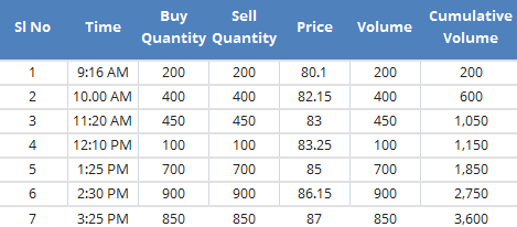
Check this data showing volume of different Stocks
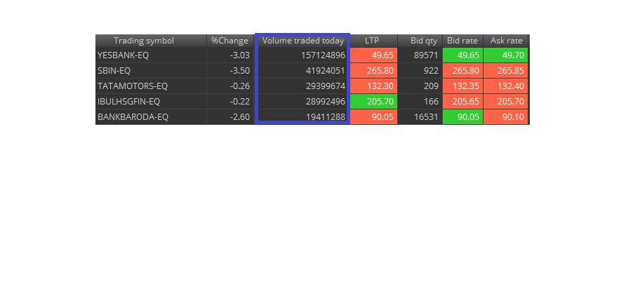
As you can see in above image, blue box represent the volume of shares traded during live market of few stocks listed on NSE.
All the volumes are in cumulative(increasing). Below is the example showing volume on a usual trading day, please make a note how this adds up at the end of the trading session.
It’s important to note that when counting volume, each buy/sell transaction is counted only once.
This war between buyers and sellers for the best price in all different time frames creates short-term price movement.
However the point is now you know what volume is, but how this going to help you at all. Simply seeing volume does not give any idea as to what exactly is happening in a particular stock.
When analyzing volume, there are guidelines we can use to determine the strength or weakness of a move.
Volume can be very useful in identifying bullish and bearish signs in a stock.
How To Use Volume Data In Trading and Investing?
You have observed this couple of times while trading, when any stock-specific news items are released like good quarterly earning or new production site setup for any company.
Market react towards such news with buying resulting in high volumes.
Similarily any negative news have a bad impact which causes negative reaction and spike in volumes.
Volume in price and expectation moving forward
Volumes should be looked at relative to recent history. It is best to compare today’s volume to average volume of last 10, 20 or 50 days for seeing irrelevant data.
The more recent the data sets, the more relevant they are likely to be.
When we say increase in volume this actually mean today’s volume is higher than the average of the last 10,20,50 days volumes.
Understand this once again if there’s a higher volume of trading in a particular stock, that usually means that investors are interested in buying or selling it.
If volume and price are on the rise, it means investors are betting the company will do well.
Whereas if volume is up but price is down, it means more investors are looking to sell.
Also remember higher volume for a specific security results in higher liquidity.
Knowing what other investors are trading is important for understanding what stocks are in play and which are likely to make big moves.
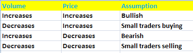
Let us understand the content of above table
- If both Volume and Price Increases, this will results in bullish view on stock in further trading session.
- If volumes are decreasing but stock price is increasing than there are more retail participation rather than institutional investors. One need to avoid such situation as it might be a bull trap.
- Whereas if volumes are increasing but price of stock is decreasing than big investors are selling, hence view on stock should be bearish.
- In case both volume and price are decreasing than it means the price is decreasing because of small retail participation, and not because of institutional investors are selling.
- Volume is also decreasing as retailers are selling rather than big investors. This situation can lead to bear trap, one need to avoid placing trade in such scenario.
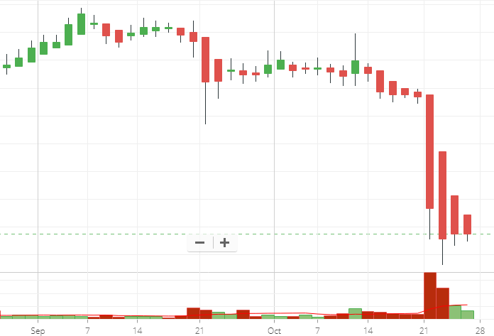
Please take a look on the given chart below of INFOSYS LTD.
This happened due to the recent rumor (news) of a whistle blowers who alleged that Parekh and Roy were using aggressive accounting strategies.
Also, potentially hiding information from auditors to boost revenue and profit margins.
This lead to spike in volume with decrease in price.
You can easily draw a moving average on the volumes bar to know if today’s volume is higher than the previous days volume average of 10,20 or 50 days.
To get the last 10,20,50 day average, all you need to do is draw a moving average line on the volume bars on your trading terminal.
Always use the above indicators or tools in combination with one another to get the most benefit.